
Samí Deli App
Samí is a dedicated app for a popular local deli named samí that allows users to easily order artisan sandwiches online for pick-up.
Role: Lead UX Designer
{Product development, interviews, visual design, wireframes, prototyping, iterating on notes}
Development Software: Figma, Adobe Photoshop
Duration: Jan 2021 - May 2021

The Problem:
The lunch rush at this beloved artisan deli samí can lead to long lines and waiting, wasting a precious hour of a lunch break for local workers and busy parents.
The Goal:
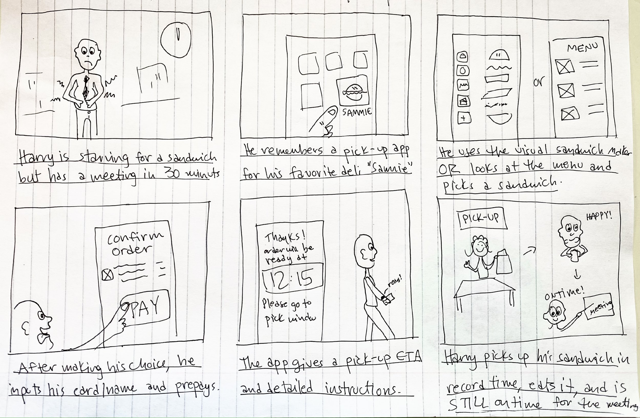
Create a sandwich-ordering app with a comprehensive user flow that allows for substitutions and custom preferences so users can order their sandwiches online the deli can prep your order and cut down on wait time.
Research
With the popularity of this downtown deli, we wanted to create a food ordering app worthy of the delicious food they serve. The location of Samí gave us insight into their customer base — many of whom are office workers in the area who come on their lunch break.
We went to the streets to interview some regulars and ask why or why not they frequent Samí.
POTENTIAL USERS & THEIR NEEDS:
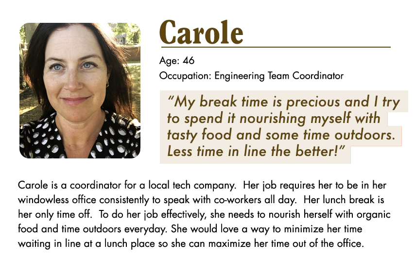

To ensure a positive user flow and compete with similar products, we interviewed customers and asked what their pain points were with previous food-ordering apps and discovered 3 main pain points:
1. Dietary Clarity
Working adults who want healthy options should be able to see a list of ingredients to ensure they fit their dietary needs.
2. Clean Design
Most ordering apps have too many images and text on the screen at once. Simple design will help streamline the process.
3. Pick-Up Instructions
Not knowing where to pick-up the food causes confusion and anxiety from customers and users.
Getting Started + Wireframing
I began creating quick iterations of the screens with paper wireframes. The emergence of the “Build-Your-Own” visual maker emerged during the brainstorming process.

After finalizing my favorite features from the iterations, I developed digital wireframes and connected them, creating a low-fidelity prototype to test among our users.

And now… to test!
Testing + Refining

With the low-fi prototype complete, I conducted a moderated usability study to determine the viability of the app design.
I asked 7 regulars ranging from 18 - 42 with varying occupations to complete the basic user flow of ordering their favorite sandwich from the menu. A food-ordering app isn’t a new concept, our KPIs had more to do with making that process as organic and seamless as possible.
Mapping out their user journey was helpful in identifying unforeseen pain points, and 3 main points emerged as a pattern:
The visual hierarchy of the home page was confusing
The menu felt cluttered and the text was too small
Users enjoyed the sandwich builder feature (a surprise hit!)
With those points in mind, the design refinement and high-fidelity prototyping began.
I.
Our first usability study showed that our initial home page had unfamiliar composition and image hierarchy which confused users.
By changing the orientation and removing the past ordered items, we made it simple and easy to begin the user flow.

II.
Users also mentioned the menu having too small text and feels cluttered.
To make the layout more simple, we added a separate Add to Order overlay to separate the item description from the main menu page.

III.
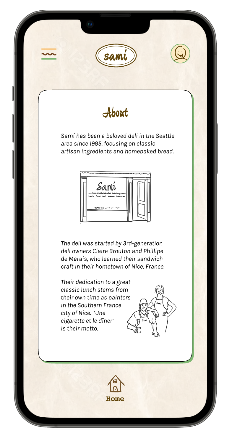
In addition to the notes, a helpful piece of feedback was how much people enjoyed the visual sandwich builder! So we enhanced that feature with original illustrations (by me).


Mock-Ups
With the notes in mind, I finished the mock-ups for the rest of the screens.


High Fidelity Prototype
Once the various user needs were addressed, it was time to connect the screens.
SEE HIGH FIDELITY PROTOTYPE in FIGMA

High-Definition Video Tour
Takeaways
IMPACT:
Having a new online ordering service for this already beloved deli makes users, customers, and the business owners happy!
Sales are up 24% at the deli. Customers are giving great anecdotal feedback on their experience with the app, and the return rate of use is over 70%.
Quote from regular costumer:
“The app made it so easy to order my faves, plus the sandwich builder feature was so fun! Even my kids use it. Glad I have this tool to make my lunch breaks quick and tasty.”
What I learned:
In the process of developing the app for the Samí deli, I learned not to be precious about my initial ideas and to listen to users about their needs. I also learned that while I love experimental design methods, UI/UX is a tool that serves a function, and learning the language of it not only helps customers, but helps me simplify and learn a new set of skills.
Learning a successful layout and being creative with how to enhance it makes for a great user experience. I had a great time speaking with folks and learning how to implement their feedback into successful, clean design.