
‘Saint Milk’ Merchandise Site
An online retail site that sells merchandise for the band Saint Milk. The site offers vinyl records, signature milk bottles, and a reliable range of sizes for apparel, and has a customizable feature that personalizes the piece to the specific show that the purchaser attended.
Role: Lead UX Designer
{Product development, interviews, visual design, wireframes, prototyping, iterating on notes}
Development Software: Adobe XD, Adobe Photoshop
Duration: Jan 2021 - May 2021


The Problem:
Fans love Saint Milk…but they don’t love waiting in long merch lines at their live shows, only to find their favorite t-shirt is sold out in their size or they’re out of the record they wanted. Plus they miss crucial onstage moments while waiting in line!
The Goal:
To have a well-designed online store that offers a more reliable range of merch, but has customizable options for apparel that lets the item still feel specific to the show they attended.
Research
Upon researching local concert-goers, we discovered that fans at live shows want to support the band and remember their night by buying merchandise and mementos from the merch booth.
However the purchasing experience at the live show can be difficult, with limited inventory sometimes fans don’t get the shirt they want or the record they want sells out, making the whole thing pointless.
Plus waiting in the long lines for the booth makes them miss out on valuable time DURING the concert. People want an easy online option that guarantees they’ll get the stuff they want and that it’s available, while still having a personalized touch that feels less lame and clinical than a normal online purchase.
POTENTIAL USERS & THEIR NEEDS:


There were 3 main issues to address when making a successful retail experience online that could improve upon the real-life process.
1. Long Wait Times
Concert-goers love to buy merchandise, but hate wasting time standing in line DURING the show and missing the performance.
2. Limited Inventory
Inventory at merchandise booths at live shows can be limited and sell out fast, and you don’t know what’s available until you’re up at the front of the line.
3. Buying online is ‘lame’
Buying merchandise online feels impersonal and doesn’t reflect the specific show you attended in real life.
Getting Started
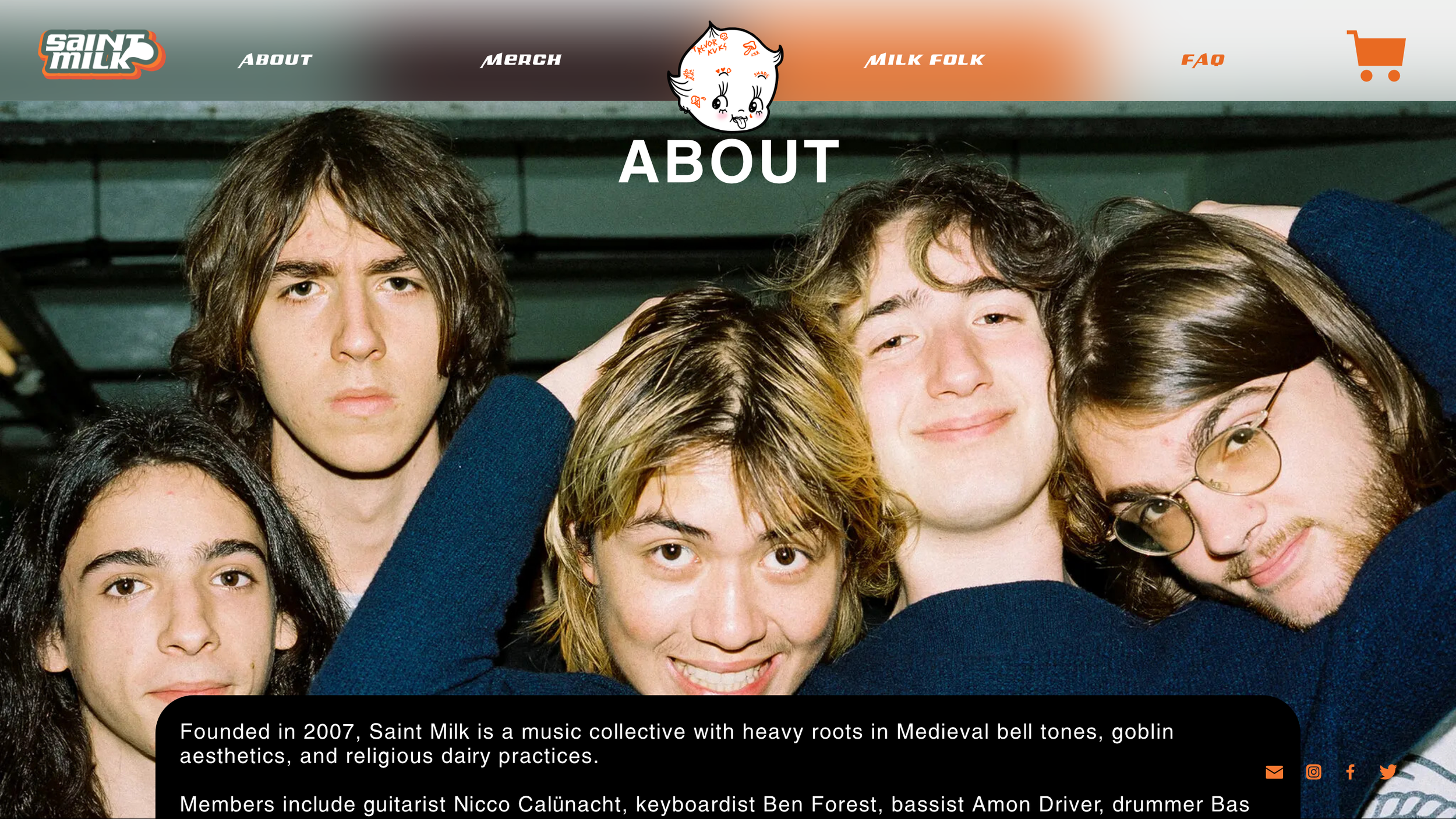
Drafting out each moment of the user journey in a site map was tremendously helpful in developing the simplest and most intuitive user flow. Using similar templates to other retail websites ensured a user familiarity as well, while still having fidelity to the spunky aesthetics of the band itself.

Wireframing
Next, I used draft paper to iterate several paper wireframes with various possible information hierarchies and compositions, highlighting sections that looked best.

After finalizing my favorite features from the iterations, I developed digital wireframes and connected them, creating a low-fidelity prototype to test among our users.


And now… to test!
Testing + Refining
With the low-fi prototype complete, I conducted a in-person moderated usability study to determine the viability of the app design.
I asked 8 Saint Milk fans from ages 16 -35 to complete the basic user flow of ordering a t-shirt with the special online exclusive customization featuring the city of the show they attended.
Mapping out their user journey was helpful in identifying unforeseen pain points, and 3 main points emerged as a pattern:
People had trouble finding certain pages without a top navigation.
The check-out process felt cluttered and confusing.
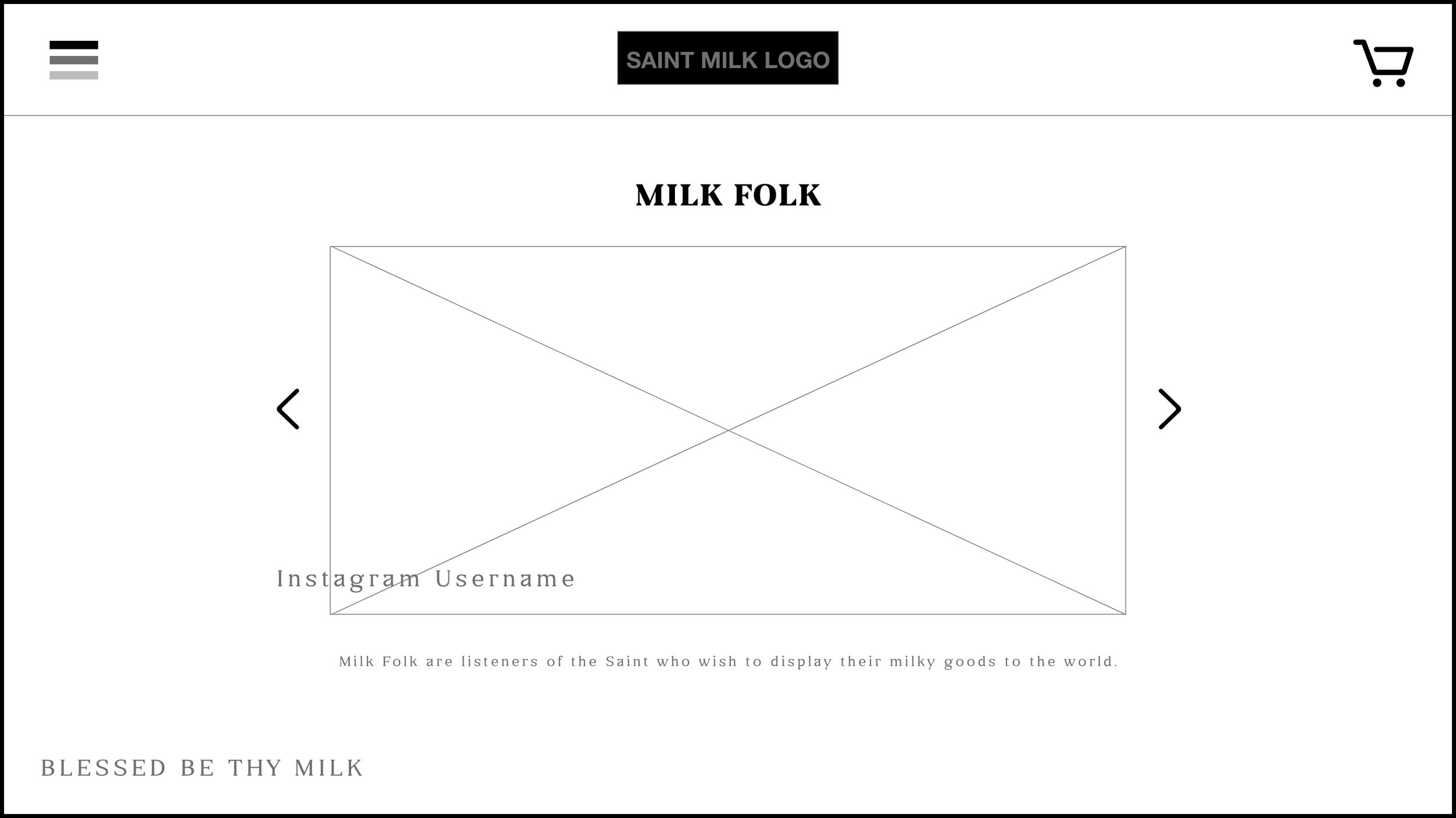
Users liked the Milk Folk page and said they’d be more likely to order something knowing their picture could end up on the website
With those points in mind, the design refinement and high-fidelity prototyping began.
MOCK-UPS
I.
Our first usability study for the browser version of the site showed that when using the hamburger navigation menu, users felt confused where pages were on the site without word links in the top navigation bar.
Initially, I thought having the hamburger menu for the browser version would make the transition to mobile easier. However through the usability study, I learned people have certain expectations for different platforms, and browser versions benefit from having named links at the top.
By removing the hamburger menu and adding links to page titles to the top bar, we made it simple and easy to navigate to different pages easily during the user flow.


II.
During our second usability study, users mentioned the check out screen feels cluttered with too much text.
To make the check out process more simple, we added a separate pages for each info section to make the order in a simple linear flow.


III.
A positive and surprising pattern in our usability study was that people loved the Milk Folk page!
By using a certain hashtag #milkfolk or #milkymerch on their social media posts, users who had purchased merchandise could appear on the site, making it more likely that they would buy something and circulate the site thereby generating more traffic.

Final Mockups
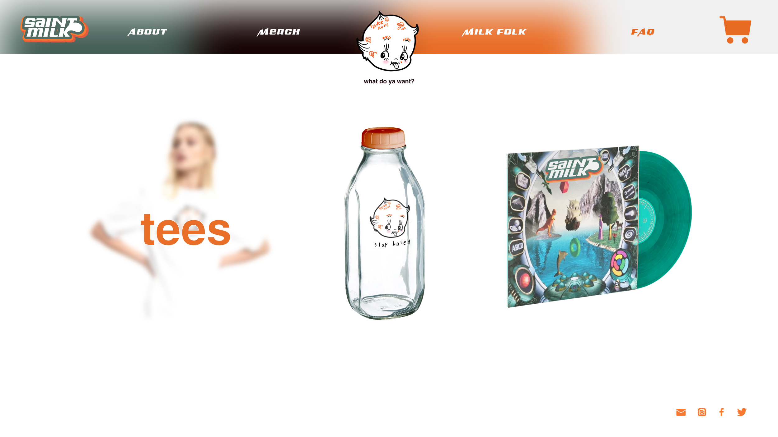


High Fidelity Prototype
Once the mock-ups were finalized, it was time to connect the screens and give the site some legs! Here are snapshots from the final product.
CLICK HERE TO SEE HIGH FIDELITY PROTOTYPE in Adobe XD

High-Definition Video Tour
Takeaways
IMPACT:
Fans are digging the new online portal! The band is happy with the matching aesthetics and in addition to an increase in online merchandise sales, the real life show merchandise lines are also less of a pain at shows.
Merchandise sales are up 32% online, which has placed less stress on the inventory of the in-real-life merch booth sales. Positive word of mouth has helped boosted the visibility and the user flow has hit no major hiccups since launch.
The fan pic carousel on the Milk Folk page has boosted social media engagement by having a legitimate site that fans are interested in participating with.
Quote from a fan:
“It’s cool to have a merch site that isn’t super cheesy or lame, and being able to add a little emblem next to the show on the back of the tee is dope. The graphics are cool!”
What I learned:
This was my first full UX project in the form of a browser site, and I learned so much about responsive design as well as how composition and graphic cohesiveness can make a difference in user flow.
I also learned Adobe XD was also a useful tool, and the subtle differences that it offers allowed me to play around with interactive features.