
handd Volunteer App
‘Handd’ is an app and responsive website that offers users easy access to local volunteer opportunities. By asking a few simple questions, handd offers both single events as well as ongoing opportunities at different charity organizations that are tailored to the interests of the volunteer.
Role: Lead UX Designer
{Product development, interviews, visual design, wireframes, prototyping, iterating on notes}
Development Software: Figma, Adobe Photoshop
Duration: August 2022 - October 2022

The Problem:
Users want to volunteer but don’t know a universal online space to find opportunities in their local area.
The Goal:
Create an easy to navigate space where volunteers can easily find charity organizations in their area and sign up for events and positions.
Research
The idea for ‘handd’ generated from my own desire to volunteer, but upon doing my own online research discovered that the index websites for discovering organizations to volunteer at were messy and hard to navigate.
To focus on making my app the most effective, I conducted a competitive audit to clarify the helpful features from other similar products, and the features that need improvement.
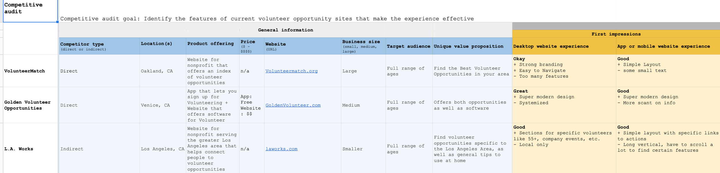

The sites for the organizations themselves were not uniform in terms of information and signing up for opportunities. There were also no filters dedicated to different types or work, or how often the volunteering would occur.
I also spoke with potential users in my area. They similarly wanted one universal place that neatly organized different organizations and provided more information so people could easily plan and share their volunteer opportunities with others.
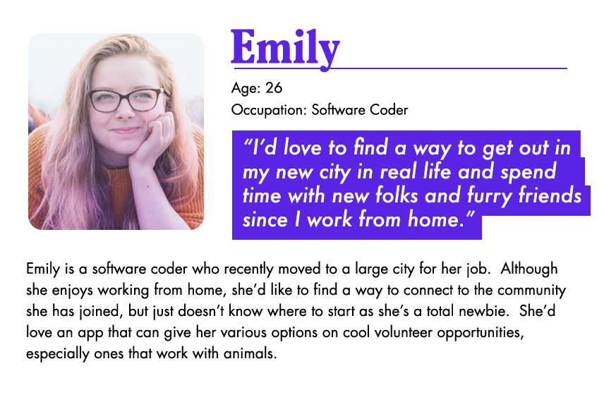
POTENTIAL USERS & THEIR NEEDS:

After the competitive audit and speaking with folks, there were 4 main issues to address with our new product.
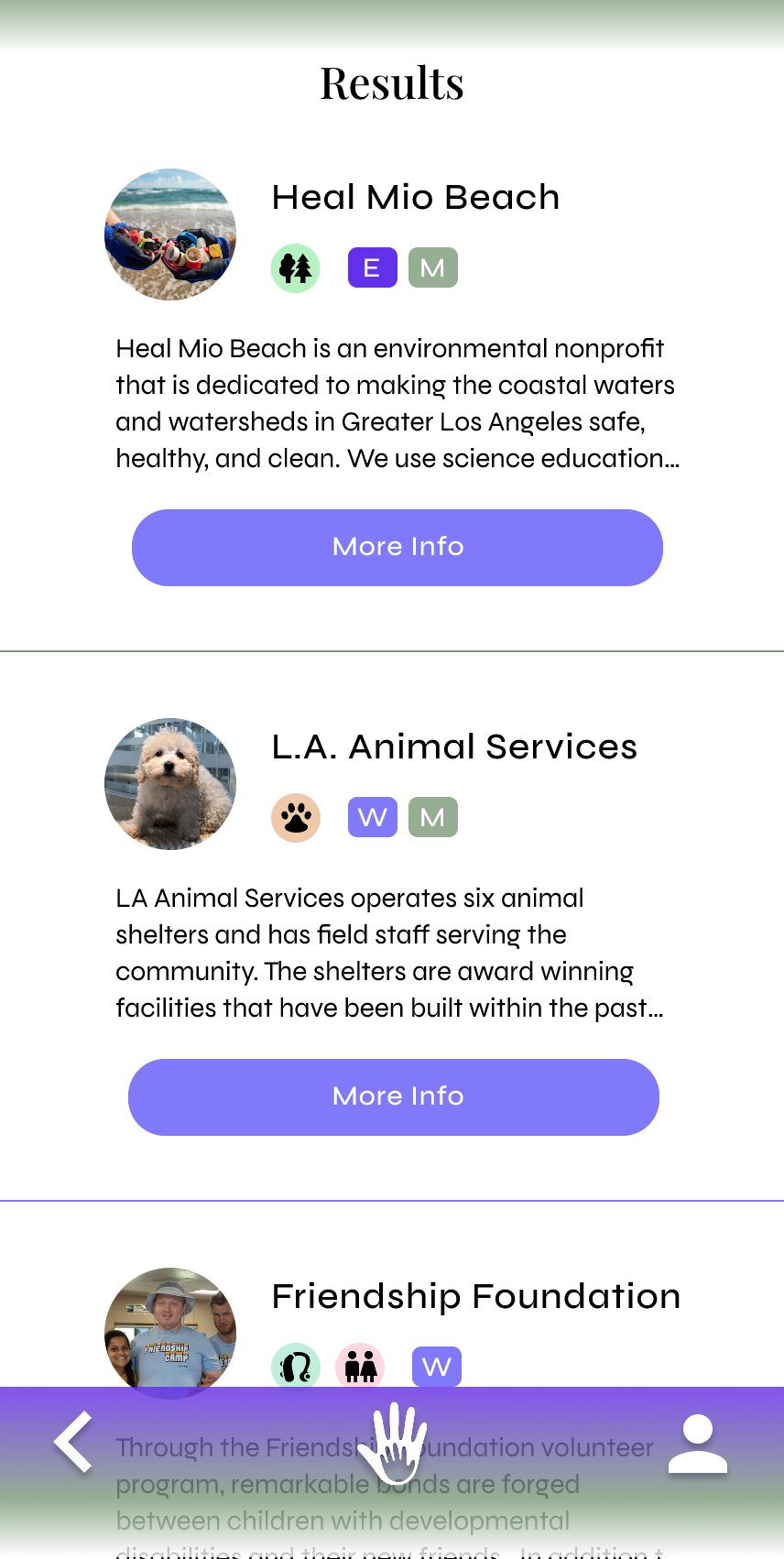
1. Messy UI
Other competitive index sites have confusing interfaces and inconsistent information. We aim to make the design clean and easy to navigate to encourage more people to sign up.
2. Specific Fields
Users want a way to narrow down their organizations towards opportunities they are passionate about. Creating an effective filter system will help accommodate that desire.
3. Encouragement
Once people are out of school, their volunteership isn’t awarded beyond its own measure. By creating a cute trophy system in the app, we can encourage the continuous volunteering.
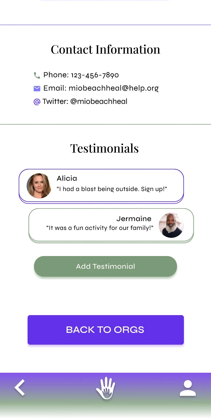
4. Testimonials
Users want a way to gauge an experience at a certain organization. We’ll provide a testimonials section for users to share their experience with others.
Getting Started
Drafting out each moment of the user journey in a site map was tremendously helpful in developing the simplest and most intuitive user flow. We wanted to make the process as easy as possible to encourage the user to follow their desire to volunteer.

Wireframing
Next, I used draft paper to iterate several paper wireframes with various possible information hierarchies and compositions, highlighting sections that looked best.

After narrowing down the best features from the paper iterations, I moved into developing digital wireframes starting with the dedicated app version.

In addition to the dedicated app, we used the progressive enhancement method to develop a browser-size version as well.
Working in a wider size allowed us try a 2-column layout, kind of emulating a bulletin board you’d find in real life but in a fun digital form.
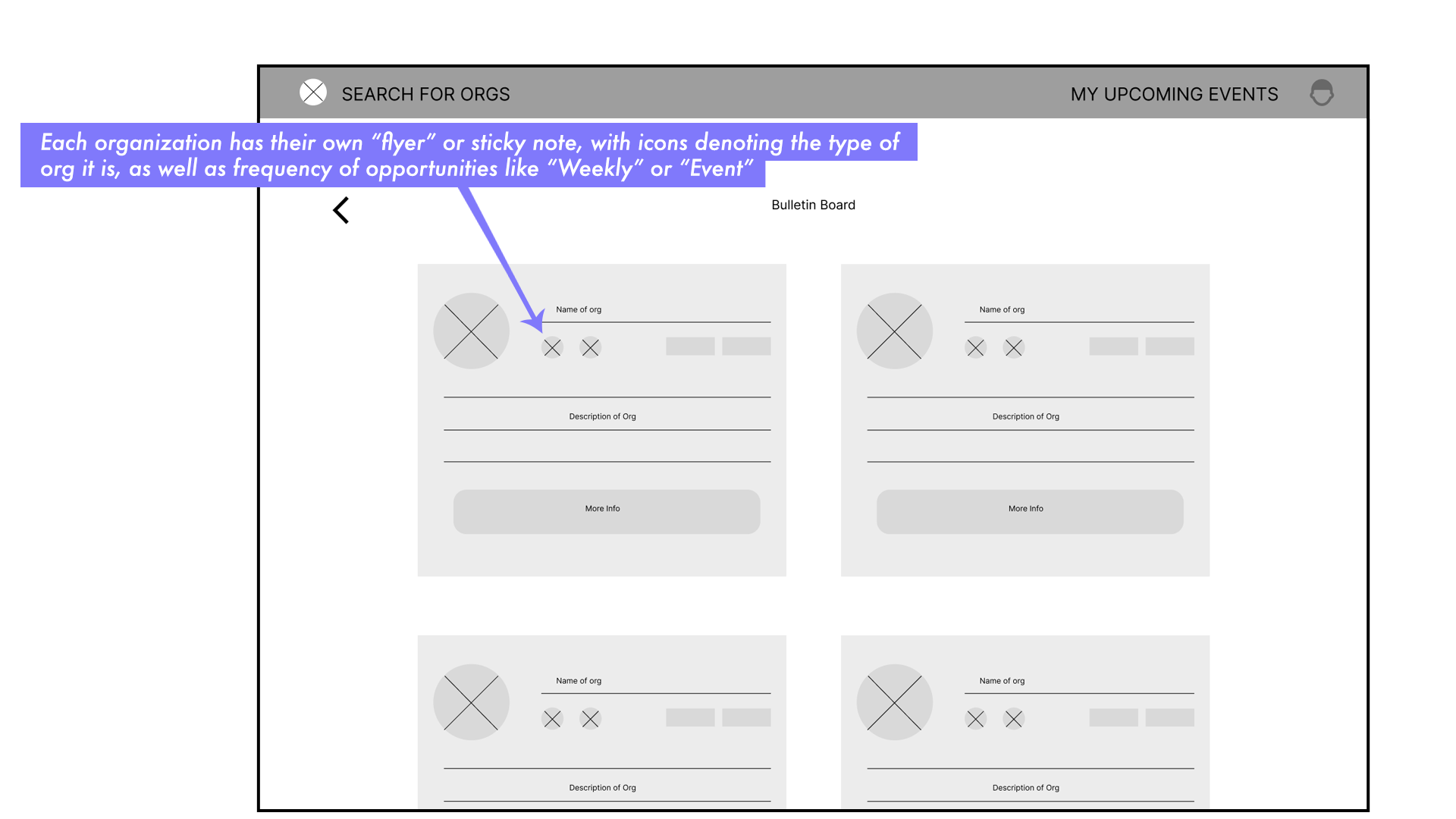
After finalizing my favorite features from the iterations, I developed digital wireframes and connected them, creating a low-fidelity prototype to test among our users.
Testing + Refining
Once the low-fi prototype was complete, it was time to move on to testing.
We conducted a remote moderated usability study with 6 participants between the ages of 15 and 53 and asked them to perform a series of prompts including signing-up for an event, as well as an ongoing position.
Mapping out their user journey was helpful in identifying unforeseen pain points, and 3 main concerns emerged:
Keep it for Volunteers
Add Favorites section
Make the trophy section of the profile bigger
With those points in mind, the design refinement and high-fidelity prototyping began. Below shows how we addressed these certain needs.
MOCK-UPS
I.
Our first major refinement we needed to make was: Keep it for Volunteers.
Though we originally wanted to app to have a function for volunteers to sign-up AND organizations to post opportunities, one of our usability test participants informed us of the strict standards a non-profit must adhere to in order to even accept volunteers.
The selection of organizations will be an internal search/qualifying process to keep the quality of volunteer opportunities legitimate and genuinely helpful to the community.
Therefore we altered the app to cater strictly to volunteers, starting the process directly with an organization filter search.


II.
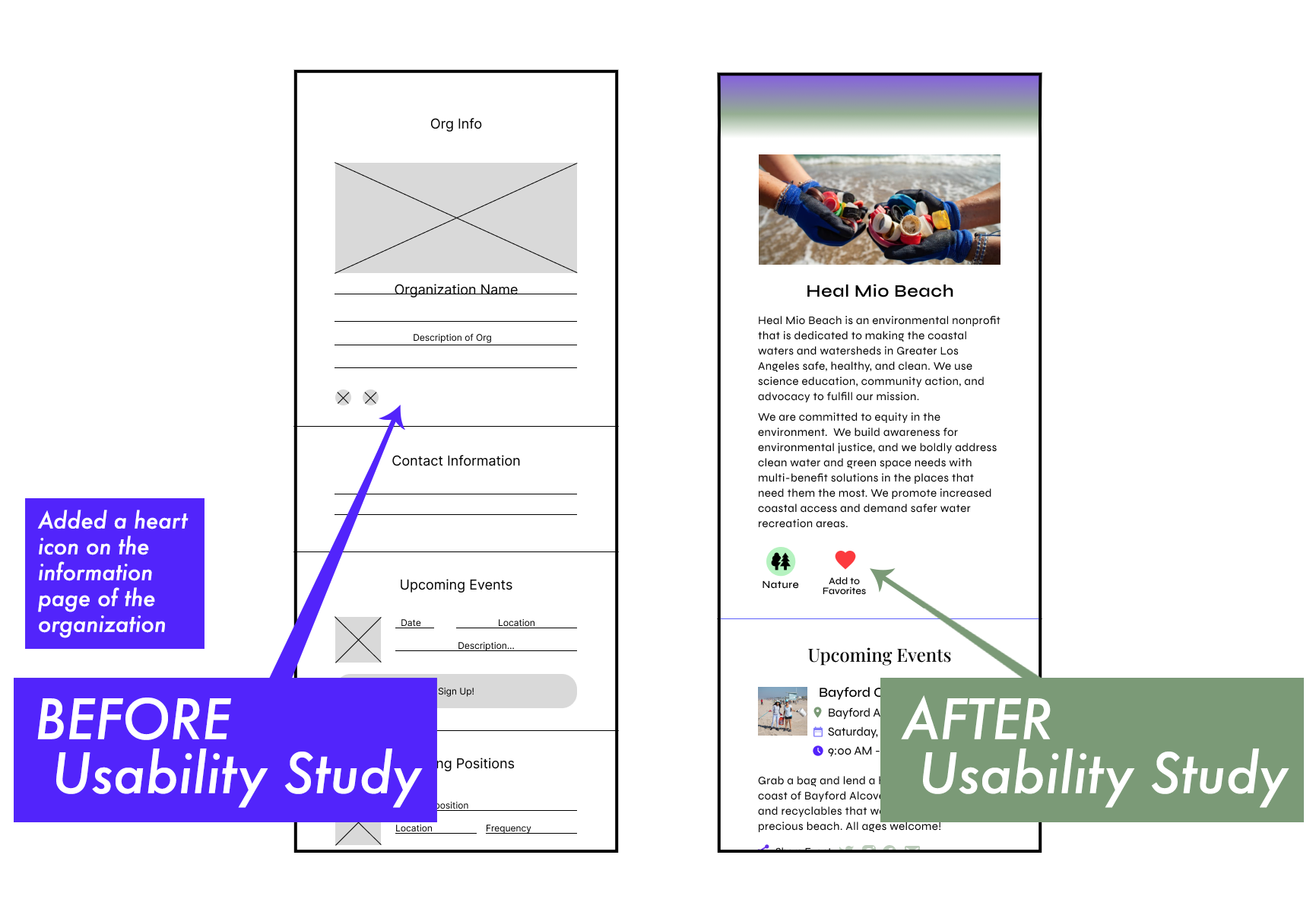
Next fix to make was adding a Favorites section.
Participants also wanted a way to access their favorite organizations without re-doing a full search to find them. Therefore we wanted to add a Favorite Organizations section to the profile page.
We also added a ‘Favorite’ action icon on the organization information page.

III.
Lastly a reoccuring note in our study was that people responded well to the Trophy Section on the profile page! Meaning we should expand the number of trophies to encourage use of app and this more volunteering.
By having cute custom graphics you can display on your profile, it adds a playful game element to volunteership and makes people want to continue.

Final Mockups


Browser Size

Tablet Size

Sticker Sheet

High Fidelity Prototype
Once the mock-ups were finalized, it was time to connect the screens and give the site some legs! Here are snapshots from the final product.
CLICK HERE TO SEE HIGH FIDELITY PROTOTYPE in FIGMA

High-Definition Video Tour
Takeaways
IMPACT:
We got great positive reactions from our study participants as well as users, who appreciated the clean design and the simple user flow to help them integrate volunteering into their schedule.
They also appreciated how easy it was to share opportunities and the app has helped not only users volunteer, but other folks as well.
Quote from a fan:
“I love how easy it is to sign up and share with friends! I got over the hump of looking for a cool org and now I’m excited to volunteer!”
What I learned:
Creating an index-style site with responsive design was an interesting challenge.
The development of this site+app became less about breaking the mould, and more about how to use aesthetics and simplicity to encourage an otherwise intimidating moment of wanting to do good, but not knowing where to start.
Also learning about the world that the app is meant to serve turned out to yield interesting, unexpected design changes.
Definitely a fun challenge and I’m proud of the original graphics and work done!